
In November 2012, municipality of MIlos island asked from the Institute of Vocational Training AKMH (IEK AKMH) and its students to design a new logo for the island with the new slogan "Milos Phenomenon". The winning logo would be used for the Branding of the island of Milos. The presentation of the logos took place in Philoxenia 2012, Thessaloniki.
Here you can see the logos I designed, and the one that selected to be used for the new corporate identity of the island.
The winning logo...
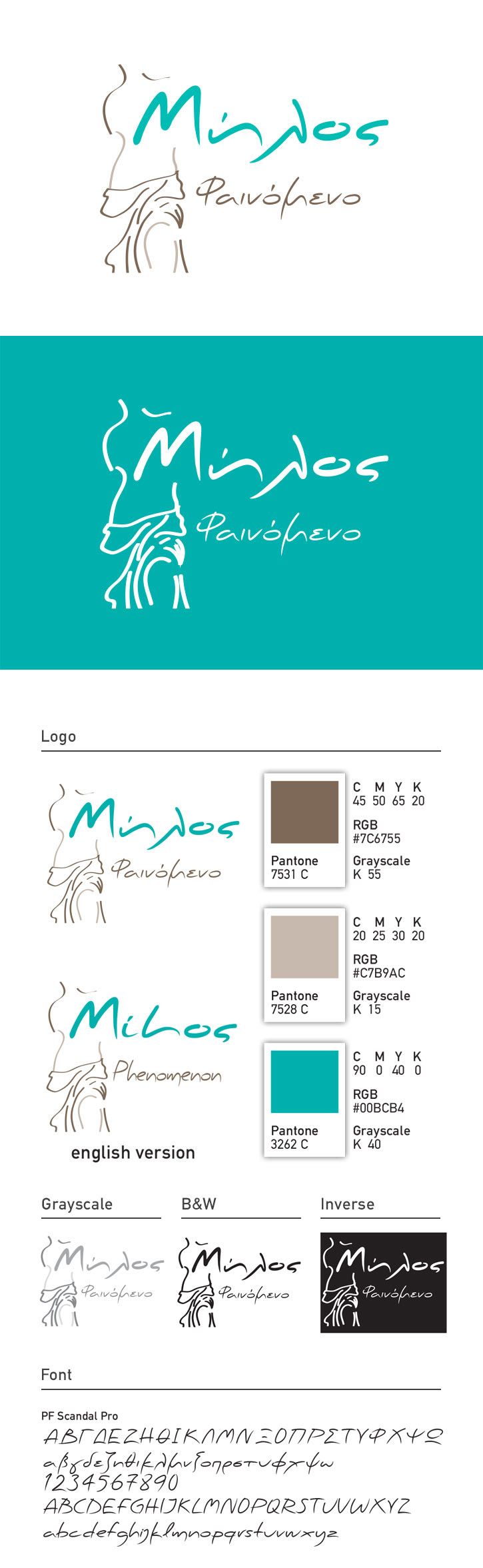
Milos island has geophysical beauties and a large history from ancient times. Although, it’s very popular because of the famous statue of Venus of Milos. This statue is actually the trademark of the island abroad.
The new logo of the island shows the statue stylized, in which only the main recognizable lines has been retained. Such as the slope of the shoulder on the left and the prominent foot to the right. They make it recognizable even now that the head has removed or other features which could make it’s identity clear.
The colors that are used in this logo are the dark brown -for the lines we want to emphasize- and light brown for details. The third color is a blue-green used the name, which refers to also famous turquoise waters of the island.

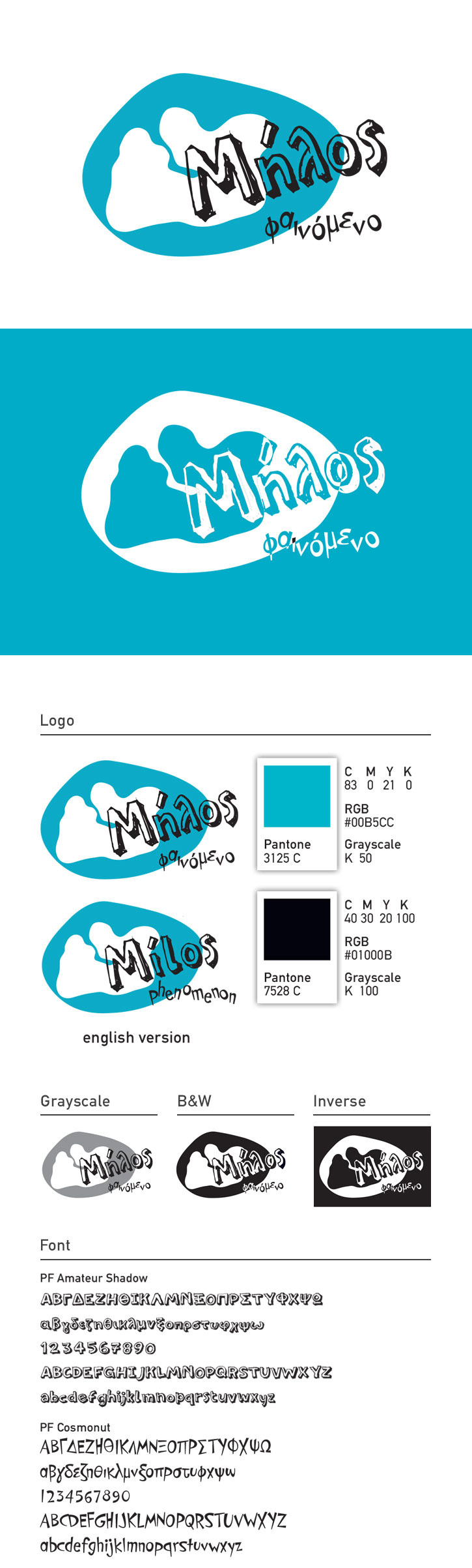
Νext proposal is modern and youthful. The white figure is the island and the green around it is the sea. The total figure refers to pebbles and through this comes the name of the island.

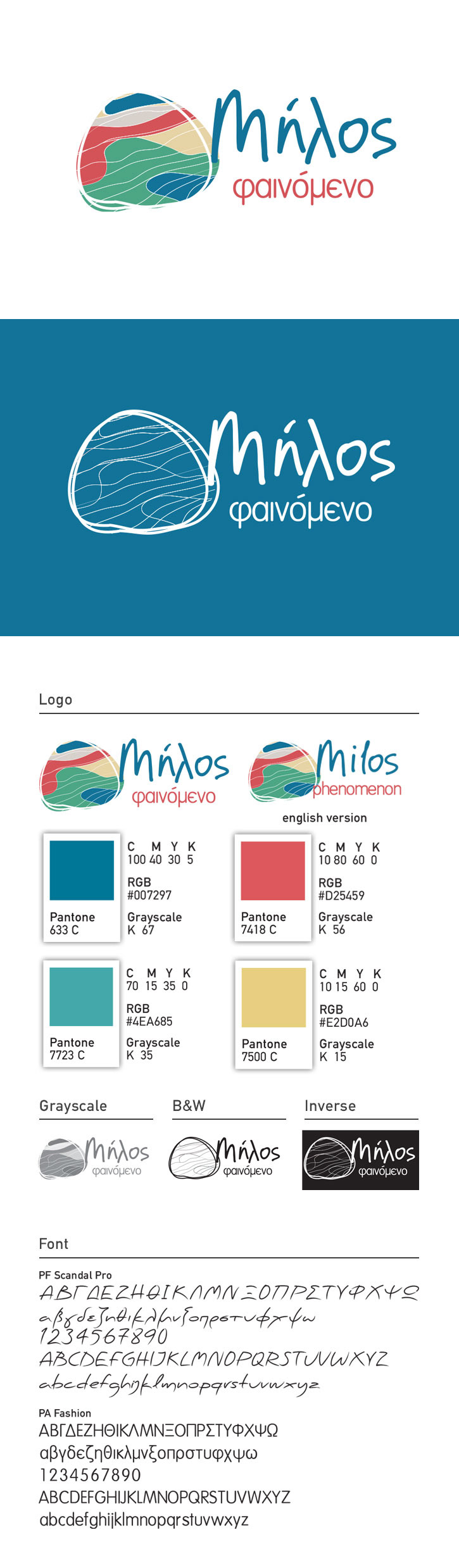
The logo below referes to Theioryheia, where the rocks and the hills have many different colors.
But, it is sad when you realise how they use and "destroy" your logo...
Thank you!